Png Info
Dimensions 5472x3648px
Filesize 5.3MB
Type Png
Png Tags

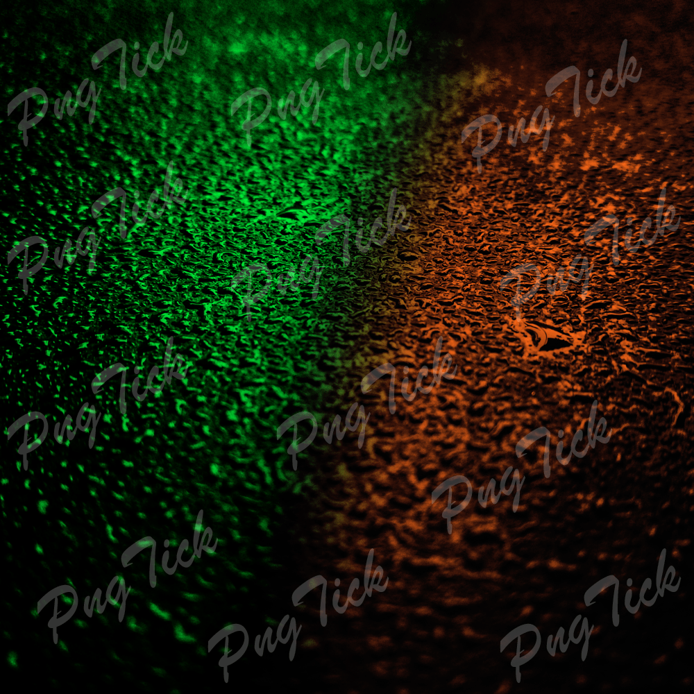
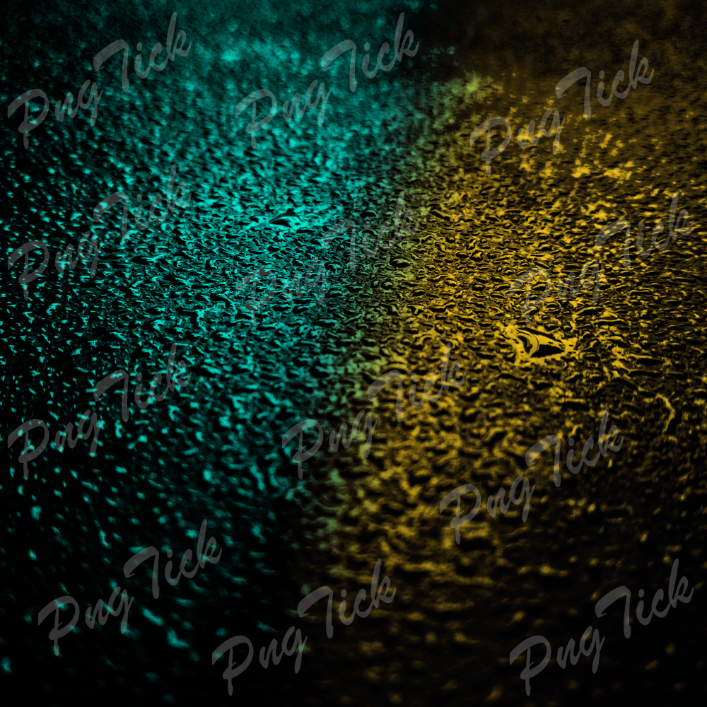
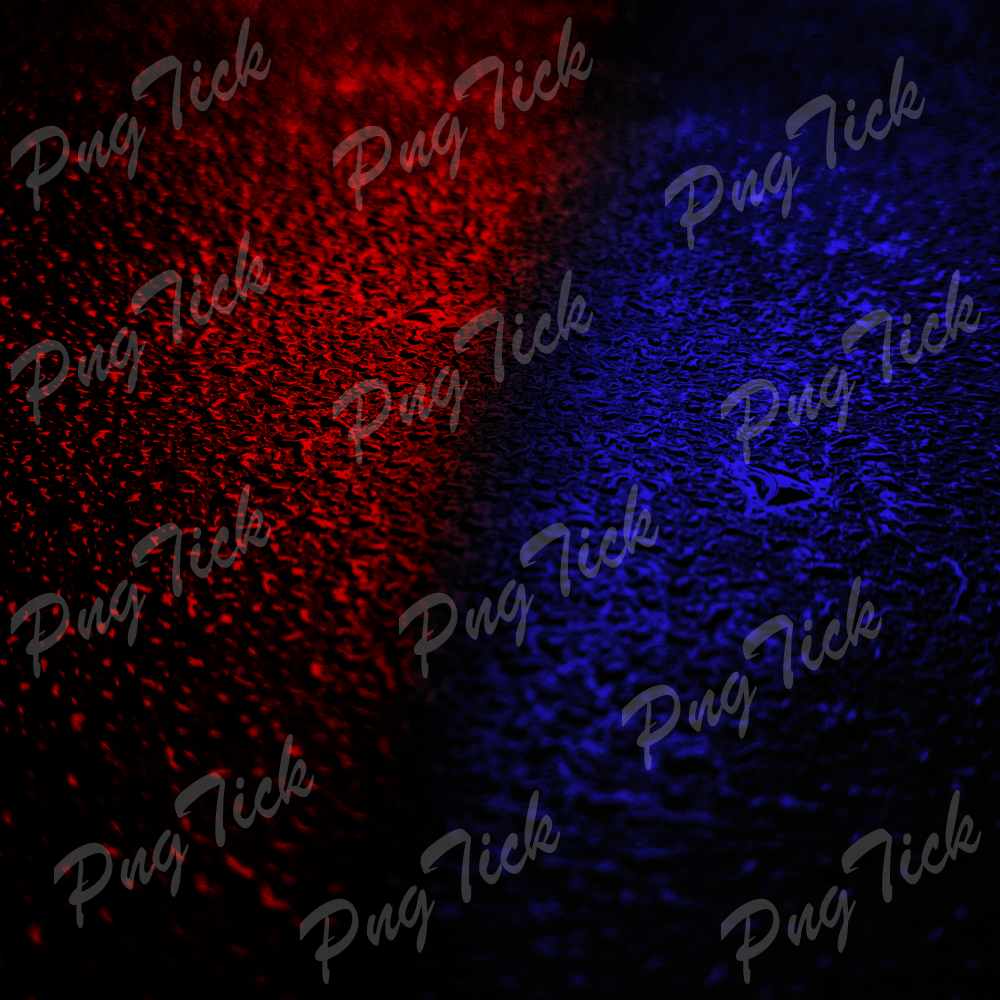
Using Two-Color Backgrounds
Two-color backgrounds are a simple yet effective design element that can enhance the visual appeal of your website or digital content. As the name suggests, these backgrounds consist of two distinct colors that create a visually striking contrast.
Here’s why you might consider using two-color backgrounds
1. Visual Contrast: Two-color backgrounds provide a clear separation between different sections of your content, making it easier for your audience to navigate and understand the information presented.
2. Emphasis: By selecting contrasting colors, you can draw attention to specific elements such as headings, call-to-action buttons, or important information. This can help guide your visitors’ focus to the most critical parts of your content.
3. Aesthetics: When chosen wisely, complementary or contrasting colors can create a visually pleasing and harmonious design. This can contribute to a more engaging and enjoyable user experience.
4. Accessibility: Using two-color backgrounds with sufficient contrast can improve accessibility for individuals with visual impairments, ensuring that your content is accessible to a broader audience.
To effectively use two-color backgrounds on your website or digital materials, consider the following tips
Color Selection: Choose colors that not only look appealing but also align with your brand’s identity and message. Ensure that the text and other elements on the background are easily readable against the chosen colors.
Consistency: Maintain a consistent color scheme throughout your website to create a cohesive and professional look.
Testing: Test your two-color backgrounds on various devices and screen sizes to ensure that they remain visually appealing and functional.
Accessibility: Always check the contrast ratio between your background colors and the text or content placed on them to comply with accessibility standards.
Incorporating two-color backgrounds into your design can help you create visually engaging and user-friendly digital content. Experiment with different color combinations to find the ones that best suit your brand and the message you want to convey.